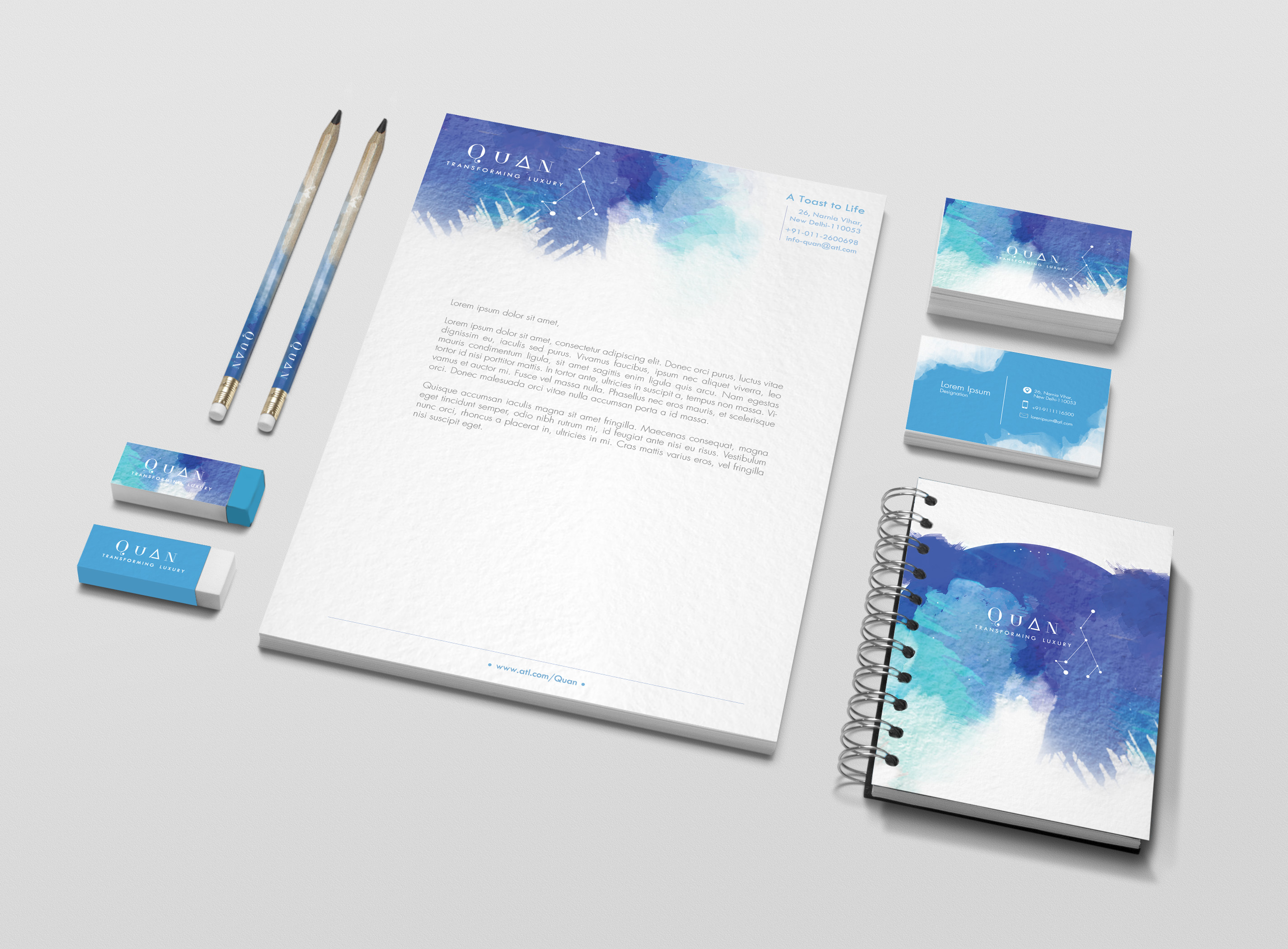
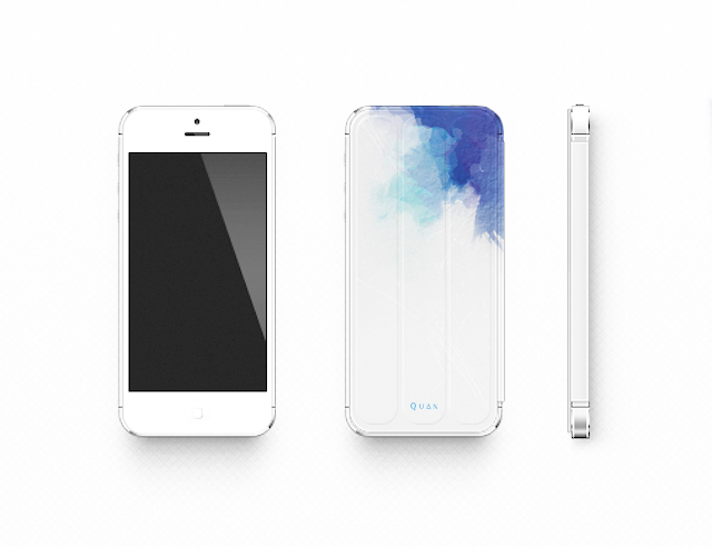
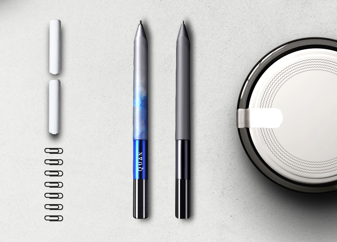
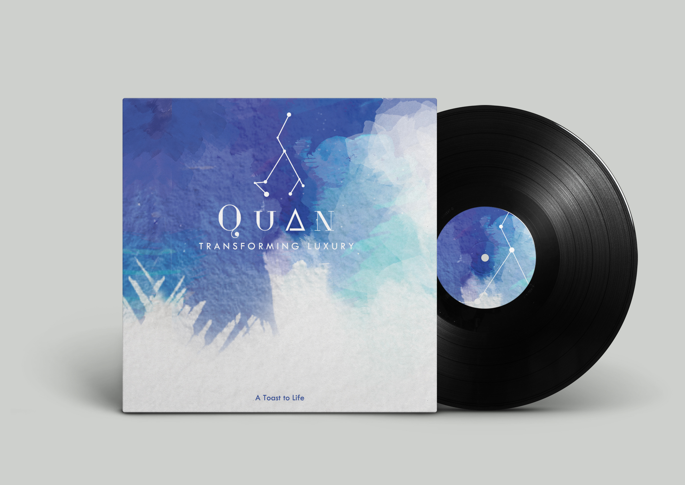
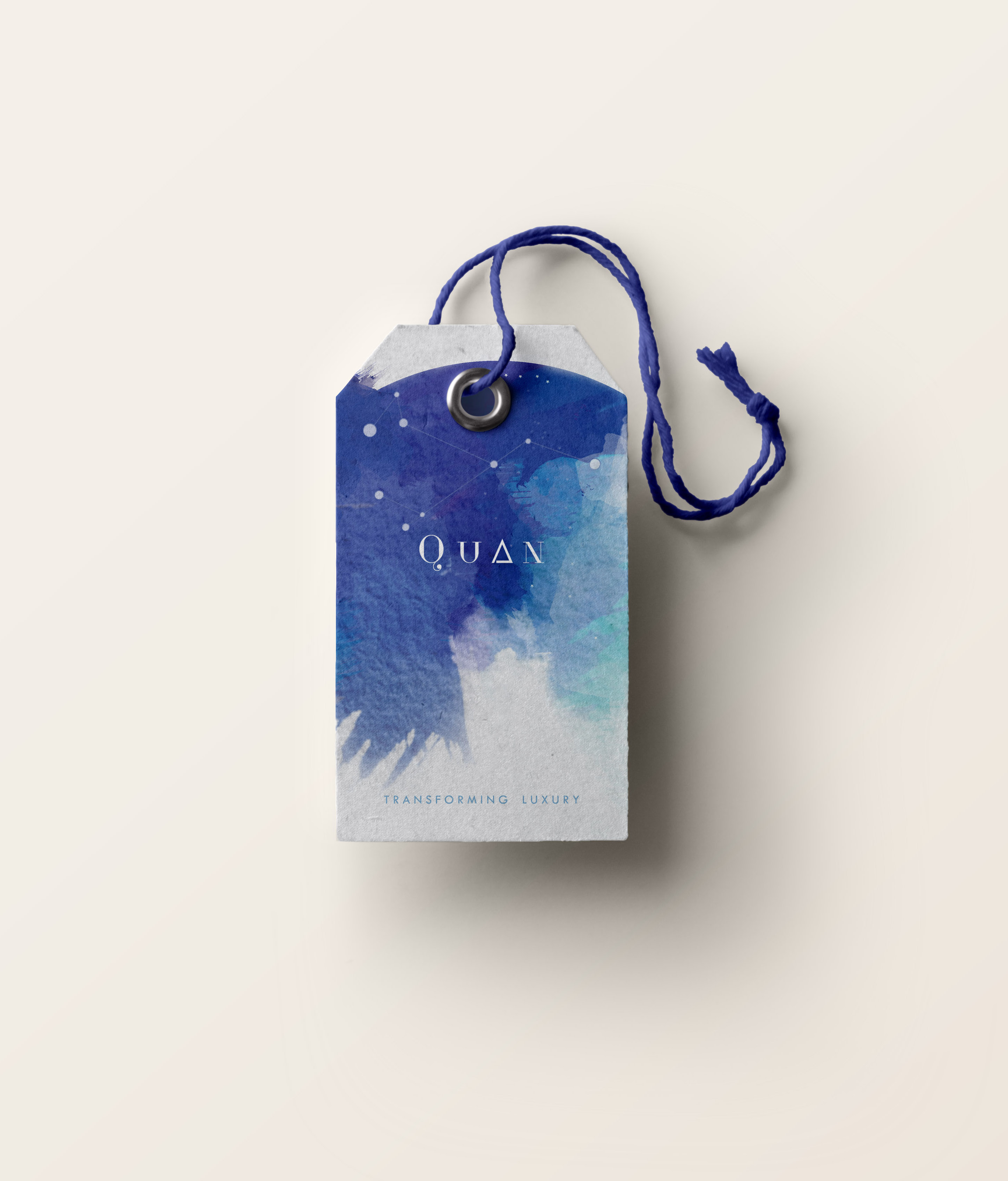
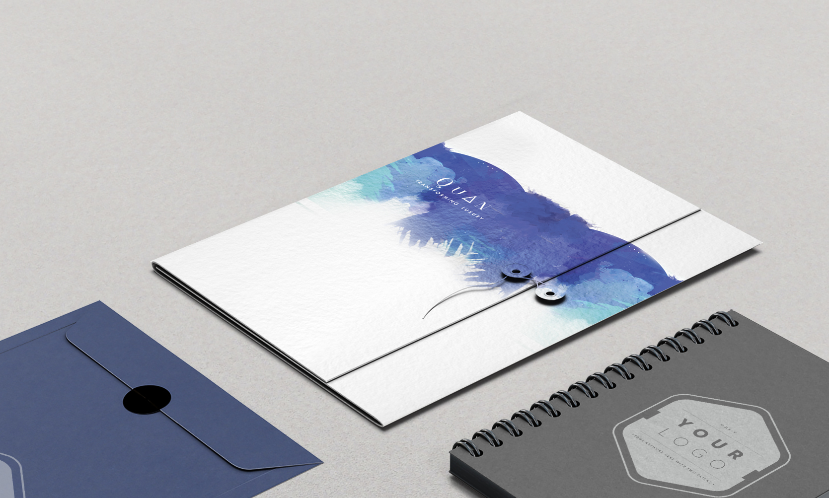
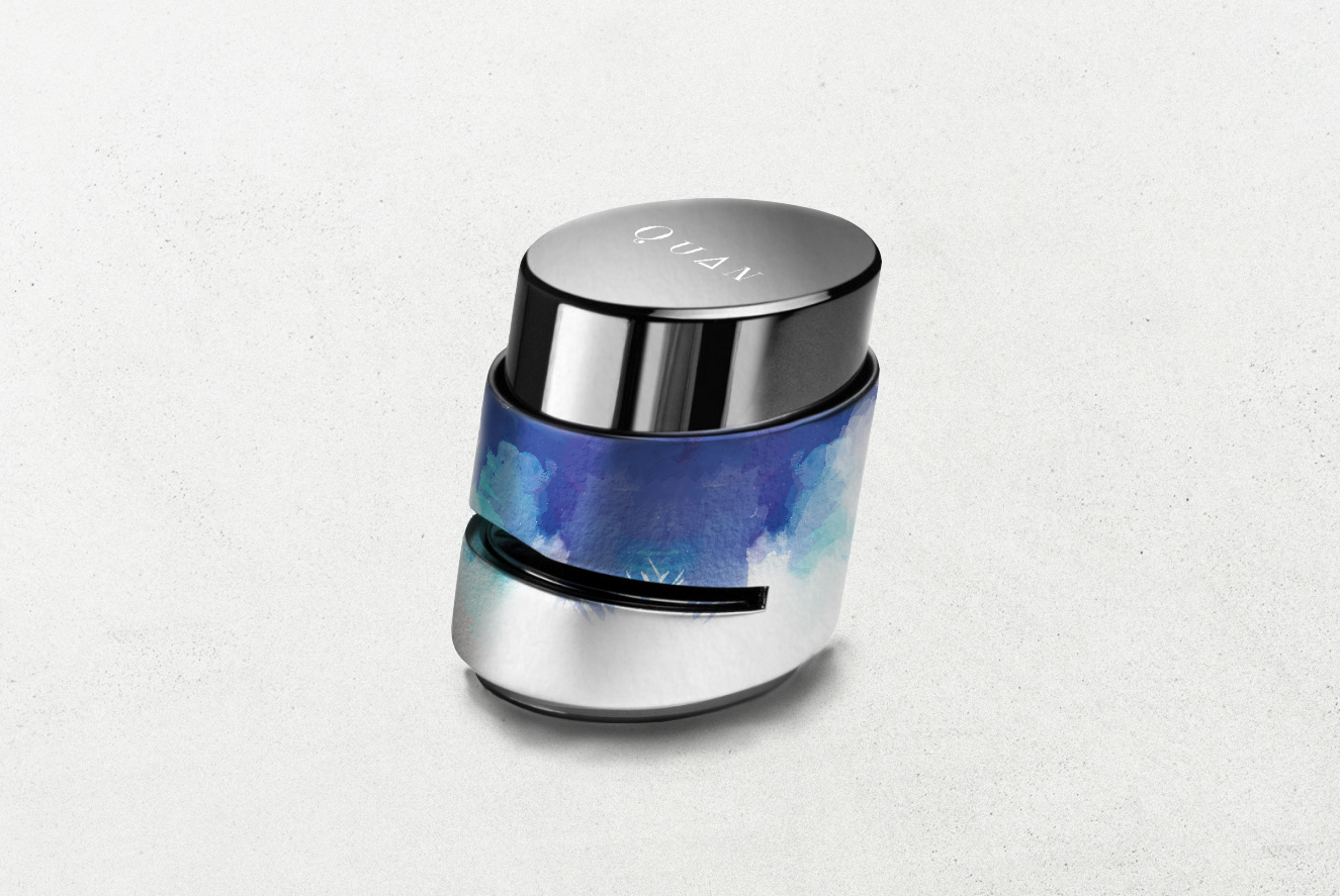
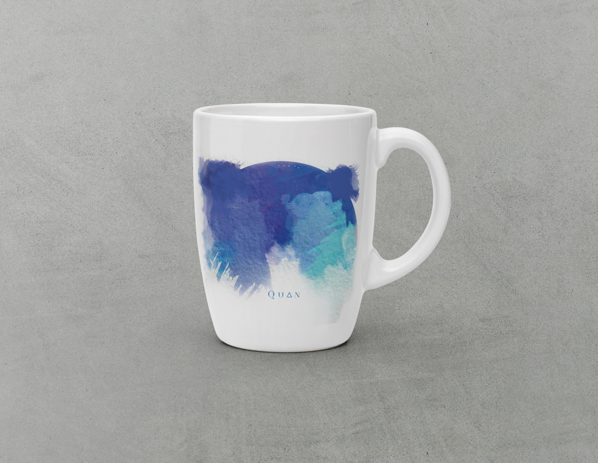
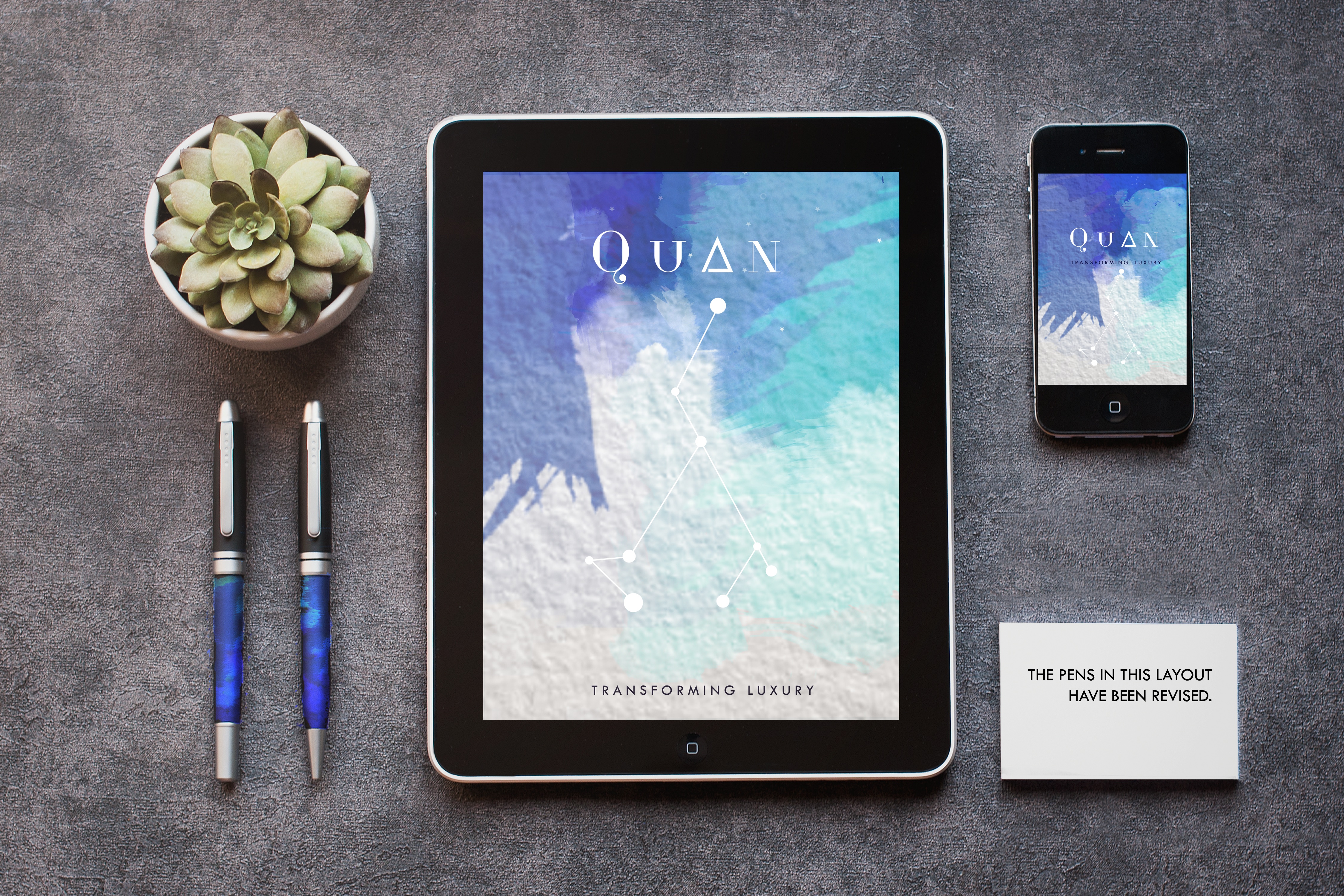
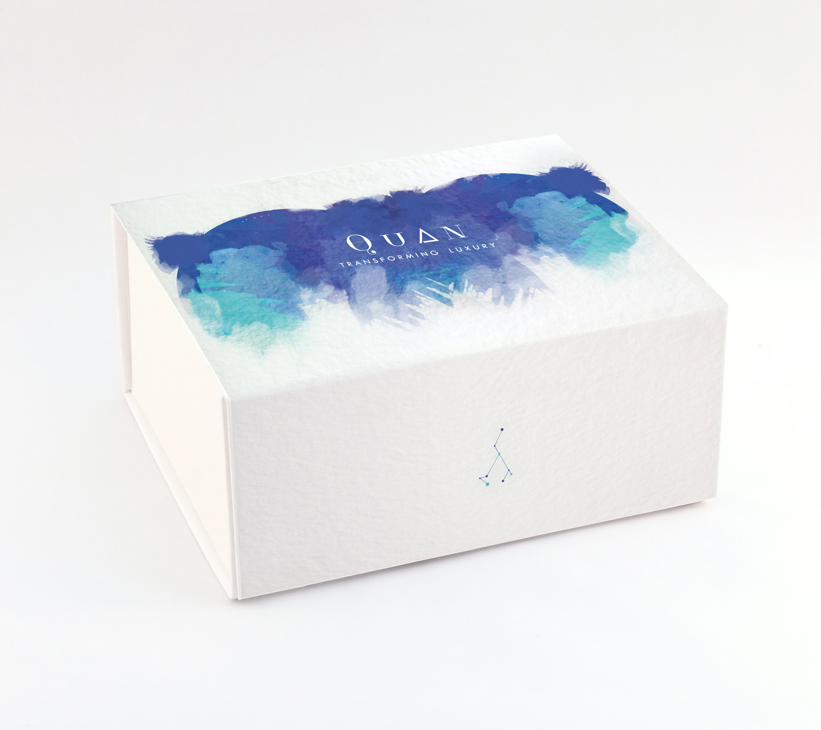
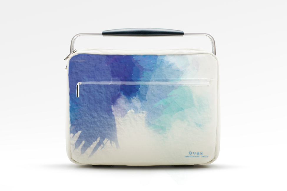
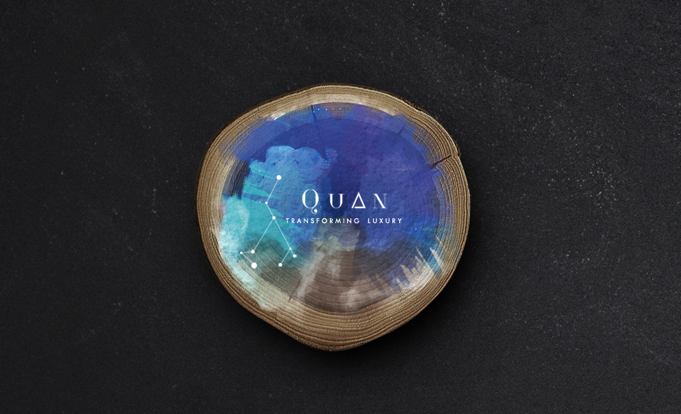
We wanted to create a brand identity that strongly focuses on the brand core and give a visual approach to the foundation of the company's processes. The brand has been seeking to bring about healing- inside out, a simplification to the process of life and living. Connecting and joining the unanswered and lost dots beginning from the childhood to the present, leading one to get clarity and broader perspectives of life and actions, and guiding one to seek the unanswered questions of life.
- Brand Identity Design
- Stationary, Packaging and Merchandise Design
The logo, brand colours and all other brand essentials draw complete inspiration from the process itself to create a brand that connects with the target consumer, inside out. From the connections incorporated within the logo to the colour selection, every element is drawn from the core.
Blue is a spiritual colour, the colour of the sky and sea. It is linked with calm and serenity and relaxes the mind and body. Similarly, purple and violet, as well as its related shades like lilac and lavender are connected with spirituality. These healing colours are also linked with perception, higher consciousness and insight. Together this helps bring about a divine design language.
